UX Case Study
uBack
Working from completed UX wireframes, produce high-fidelity screens and style guide for app development.
Background
uBack is a technology start-up that seeks to facilitate charitable giving for nonprofits. By leveraging image recognition technology in its current mobile app (available for the iOS and Android OS), uBack is “focused on driving cost saving and higher supporter engagement rates,” particularly at charitable events, bringing together donors, nonprofits, and corporate sponsors. Donors can support their cause of choice on the spot.
However, the apps were developed by separate teams, with stylistic and functional differences between them. Through an engagement with DESIGNATION, UX and UI were completed by small teams in two 2.5 week design sprints across overlapping cohorts. Building on a new UX foundation— and the already established uBack brand guidelines—my project team was tasked with UI, unifying the two versions of the app.
Problem Statement
Nonprofit organizations rely on charity events to raise their profiles and encourage charitable giving.
Unlike corporate sponsors who commit large gifts in advance, individual donors lack the ability to donate in real time.
Competitive Analysis
Our team began a short period of intensive research into the charitable giving space. To gain a holistic understanding of the domain, we looked at various mobile platforms, from both direct and indirect competitors: Charity Box, Charity Miles, Givelify, March of Dimes, One Today, and Stand4; successful financial apps: Acorns, Mint, PayPal, and some our clients’ favorite apps outside the giving and financial domains: Uber and Google Play, examining each for content, voice, and design.
Across the platforms we analyzed (even as we looked at apps as diverse as charitable giving, personal finance, and transportation), there were two very important commonalities: accessible information written in a friendly, straightforward manner and a (relatively) frictionless financial transaction experience. Design and style defined a much broader palette, which allowed us to explore diverse visual languages.
Visual Design Process
Design Exploration & Style Tiles
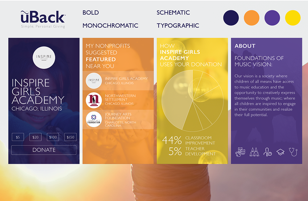
Upon completing the research phase, we were tasked with individually developing three distinctly different style tiles. Style tiles can be a challenging exploration starting from scratch. Fortunately, the uBack guidelines provided rules to both obey and defy. With a subdued color palette of indigo, silver-grey, and purple, various accent colors were added to make the designs pop.
My tiles began with a style that closely adhered to uBack’s existing brand, then moved to a visually dynamic approach through the use of diagonals that was quite divergent from current mobile design, and finally to a limited-but-still-bright monochromatic approach inspired by PayPal and Mint, while leveraging and uniting a diversity of cause-based imagery.
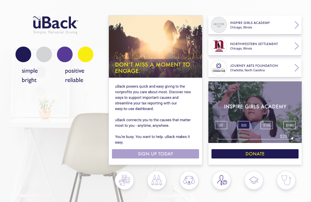
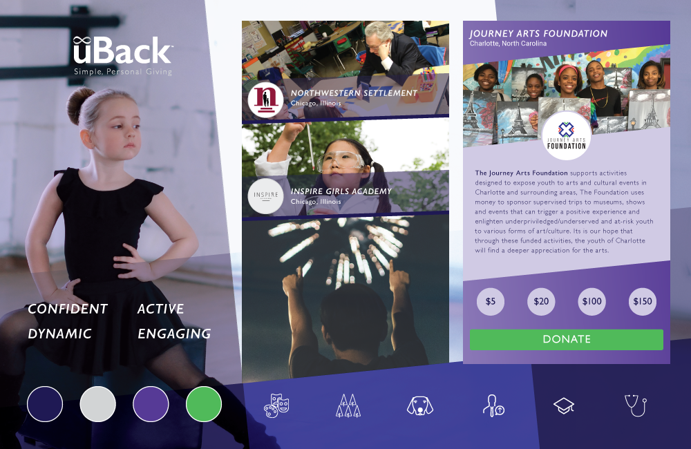
The uBack team was thoroughly engaged during the design process and were excited by all the options presented to them. With well-considered and detailed feedback on all of our stylistic choices, our individual directions were clear when proceeding to high fidelity screen designs.
Of the three style tiles I presented, the uBack team was particularly drawn to my use of large-scale, caused-based imagery, bold typography, and modestly manipulated uBack color palette that allowed for accent colors in lilac and orange.
Final Design Solutions
App Screens
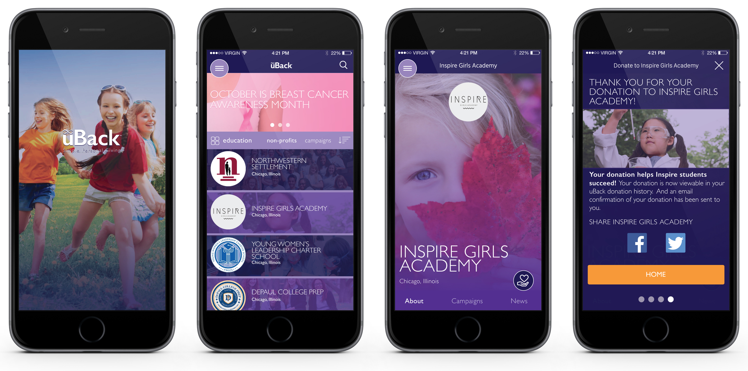
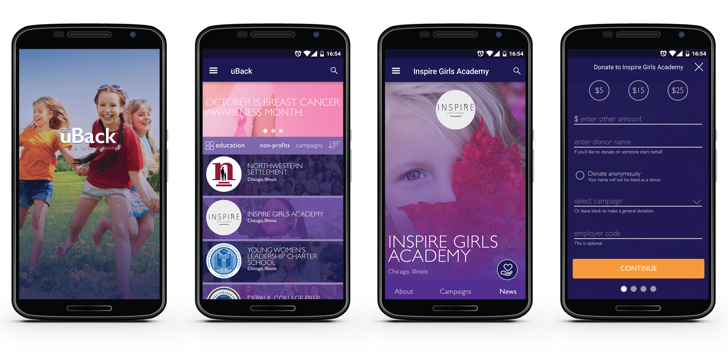
Working from the recently completed annotated wireframes, my final high fidelity designs (executed for both iOS and Android OS) leverage full-screen imagery, starting with the startup screen and continuing throughout the entire proposed app experience.
All that cause-based imagery, however dynamic, fights for attention. So the nonprofit and campaign listings make clear use of nonprofit logos for easier user recognition and app navigation. And most importantly, the donation flow strives for simplicity, limiting the screen number to four (for uBack donor account holders).
Style Guide
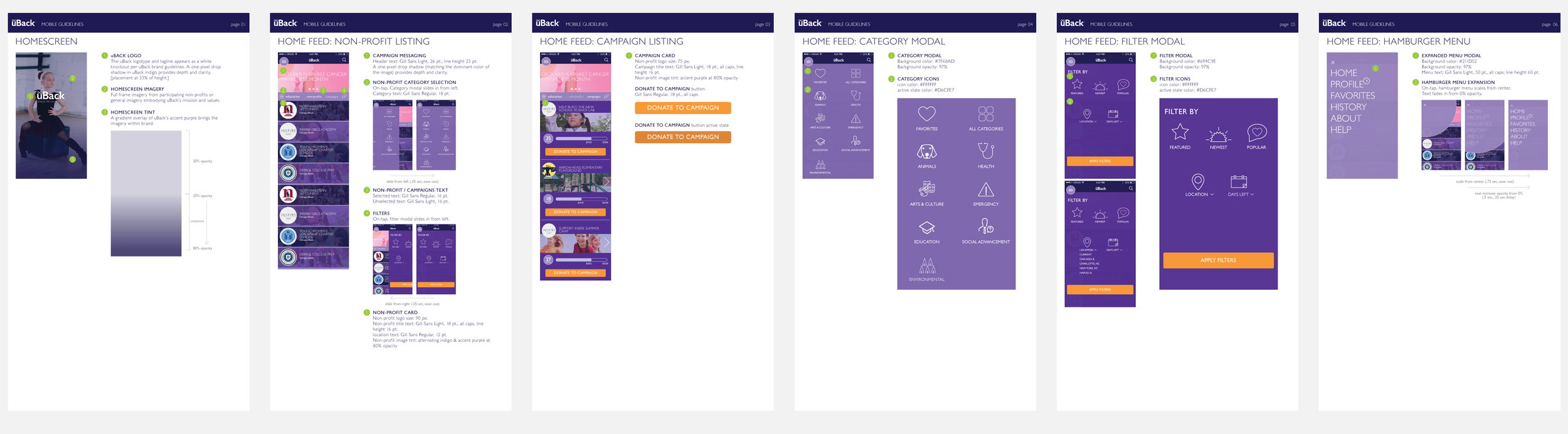
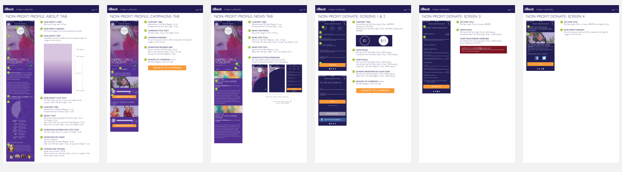
Final assets also called for a 12 page style guide.