05 // Final Design Solutions
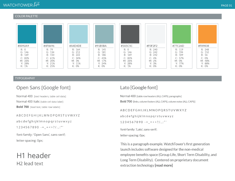
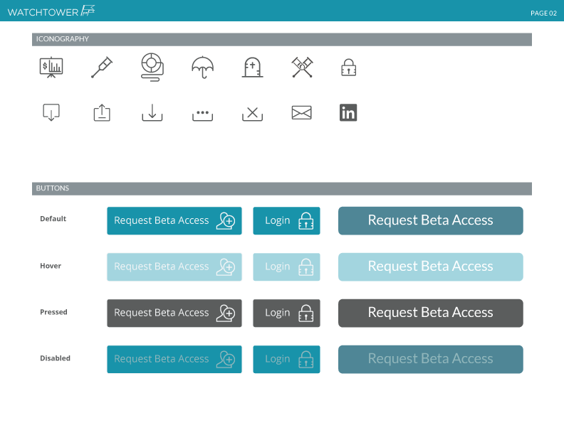
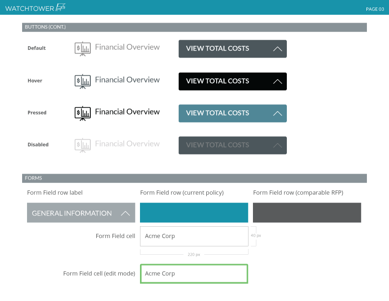
Style Guide
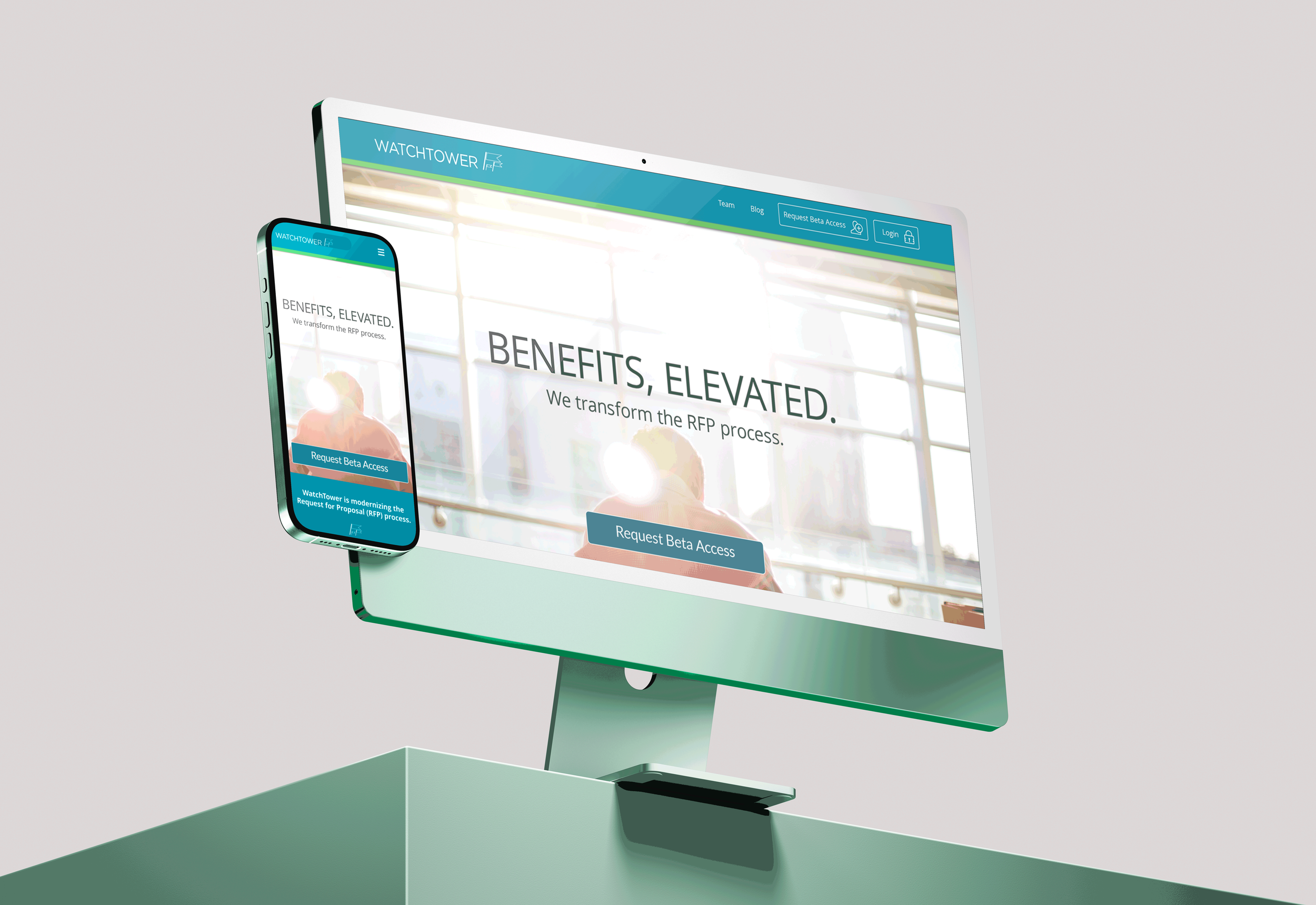
In addition to high fidelity platform screens, we were also tasked with designing a single-page promotional site for WatchTower. Again the WatchTower team was very clear-eyed in their vision for the promotional site, naming several favorite sites to emulate.
Allowing blue-green to dominate the design, the site clearly communicates accessibility and ease-of-use.
This final deliverable serves as a useful working document for the WatchTower team as they restyle the app.