
02 // Visual Design Process
Design Exploration & Style Tiles
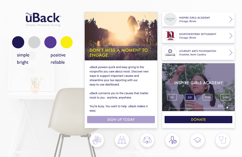
Upon completing the research phase, we were tasked with individually developing three distinctly different style tiles. Style tiles can be a challenging exploration starting from scratch. Fortunately, the uBack guidelines provided rules to both obey and defy. With a subdued color palette of indigo, silver-grey, and purple, various accent colors were added to make the designs pop.
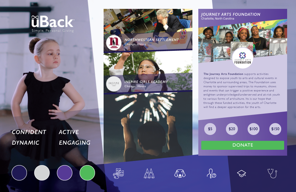
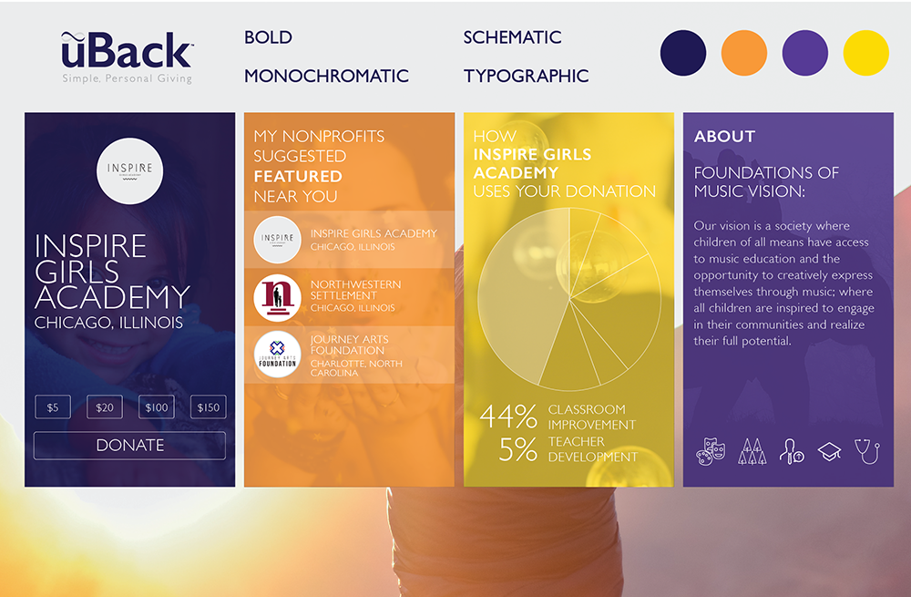
My tiles began with a style that closely adhered to uBack’s existing brand, then moved to a visually dynamic approach through the use of diagonals that was quite divergent from current mobile design, and finally to a limited-but-still-bright monochromatic approach inspired by PayPal and Mint, while leveraging and uniting a diversity of cause-based imagery.
The uBack team was thoroughly engaged during the design process and were excited by all the options presented to them. With well-considered and detailed feedback on all of our stylistic choices, our individual directions were clear when proceeding to high fidelity screen designs.
Of the three style tiles I presented, the uBack team was particularly drawn to my use of large-scale, caused-based imagery, bold typography, and modestly manipulated uBack color palette that allowed for accent colors in lilac and orange.