09 // Visual Design
As lead UI designer on the project, I was tasked with establishing the visual language of our investing app. Working from the competitive analysis data, I knew the color palette had to evoke stability and reliability.
But to truly distinguish the app in this new investing marketplace and appeal to the target audience, the app needed to depart from the all-business tone of the existing investment space.
Design Exploration & Style Tiles
Two distinctly different names and creative approaches emerged from brainstorming sessions: Vested and Blue Tip.
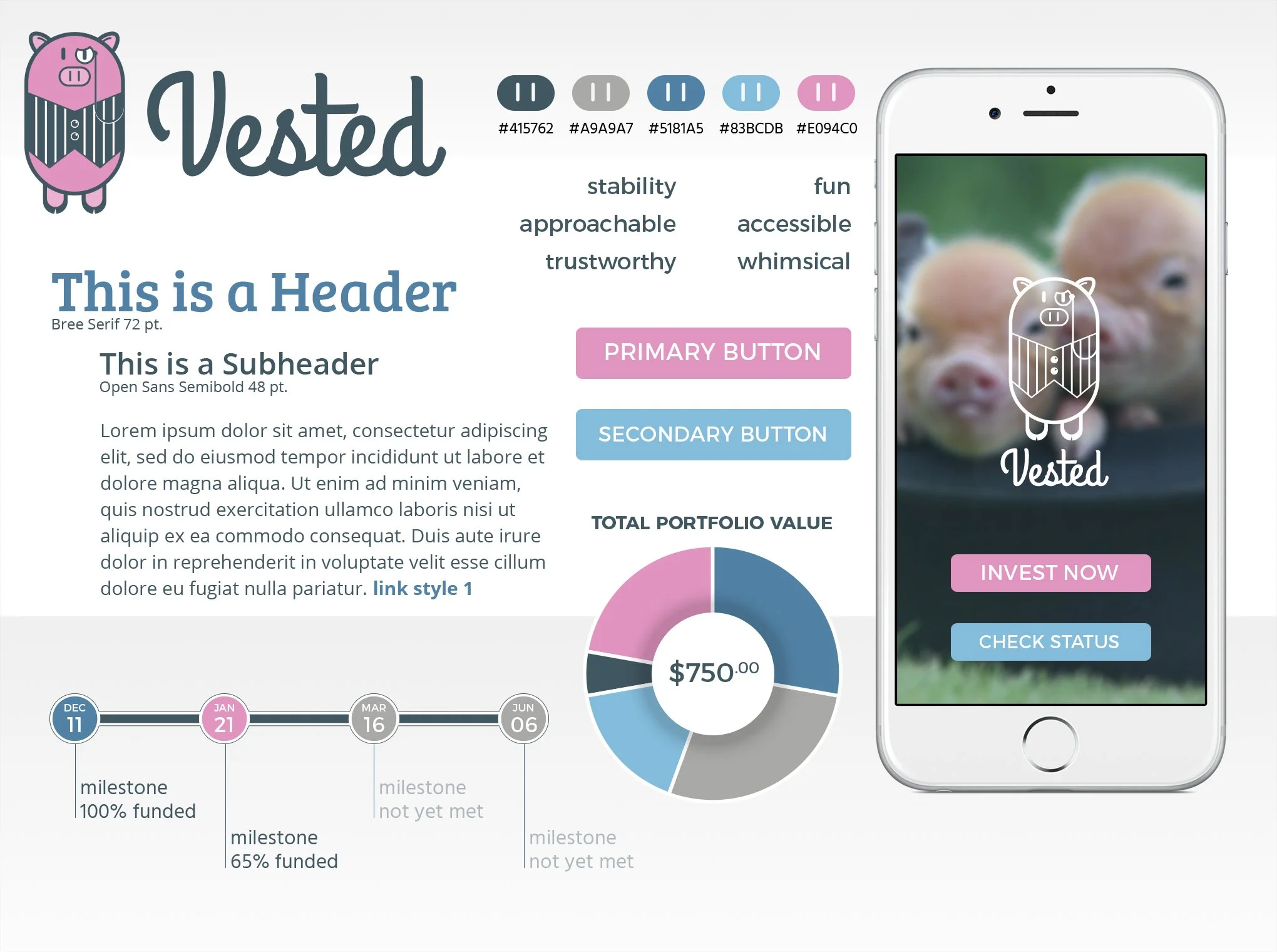
Vested came from having a ‘vested’ interest in a business or organization. After working through several abstract logo iterations to only modest success, I tried a different approach, using the other definition of the term vested and blended it with a variation on the familiar piggy bank. The distinguished but humorous ‘vested’ pig mascot showed immediate appeal and comfortably matched the design principles of accessibility and connection. But even so, the pig wasn’t quite an accurate representation of our validated matching concept.
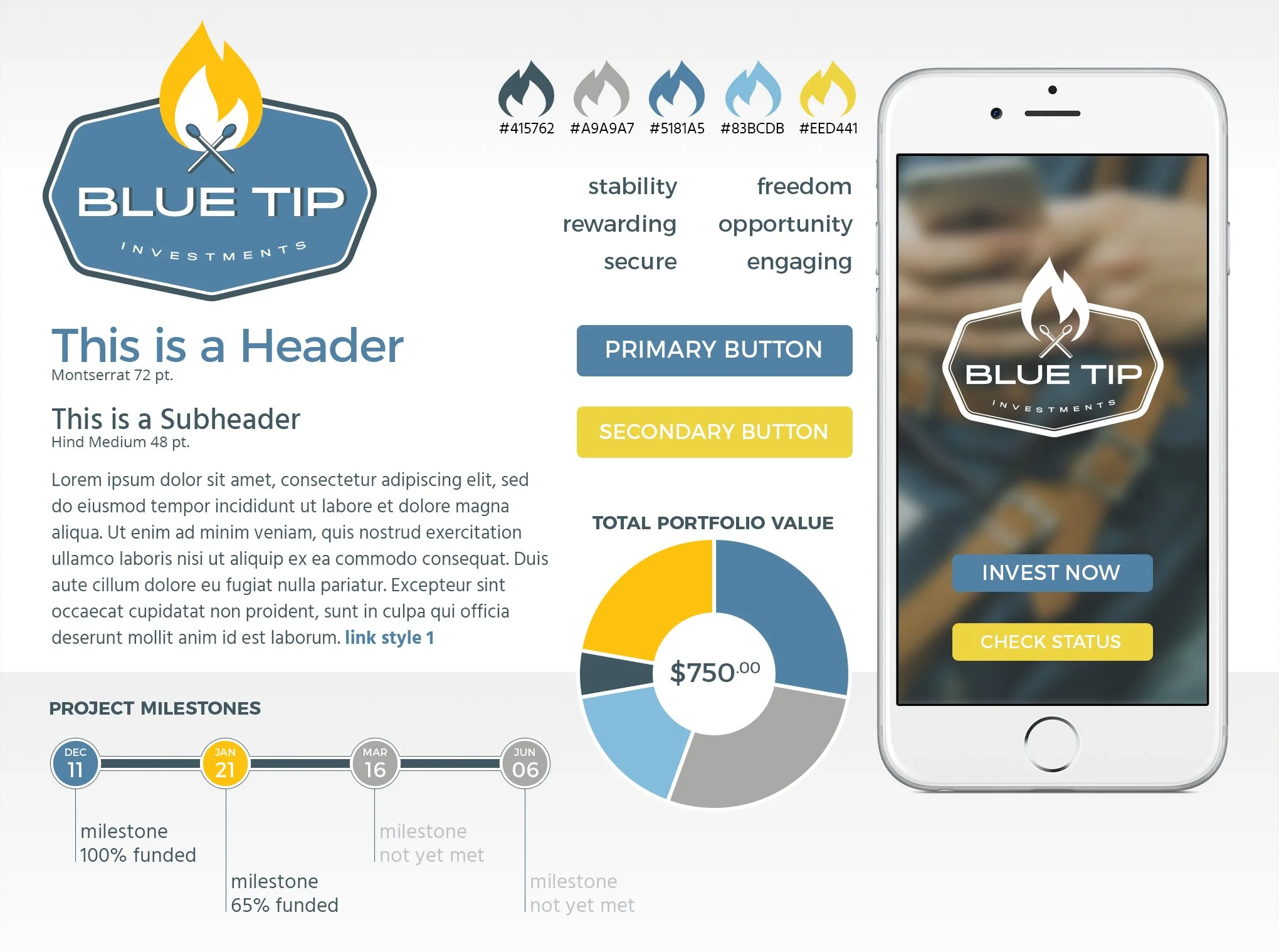
With Blue Tip I took a more literal approach to ‘matching’ (but clearly enough of a departure from the Tinder mental model), and made a secondary reference to stable ‘blue chip’ stocks. Subsequently, Blue Tip corresponded to the design principles of opportunity, accessibility, transparency, and connection.
With two very different concepts, style tiles were created for the two design directions. Both color palettes stayed within the aforementioned blue range representing stability. Vested incorporated a pink accent, corresponding to the monocled mascot. BlueTip incorporated an amber/orange, complementing the blue/grey and representing the fire of the lit matches (while avoiding the aforementioned taboo red).
Final Design
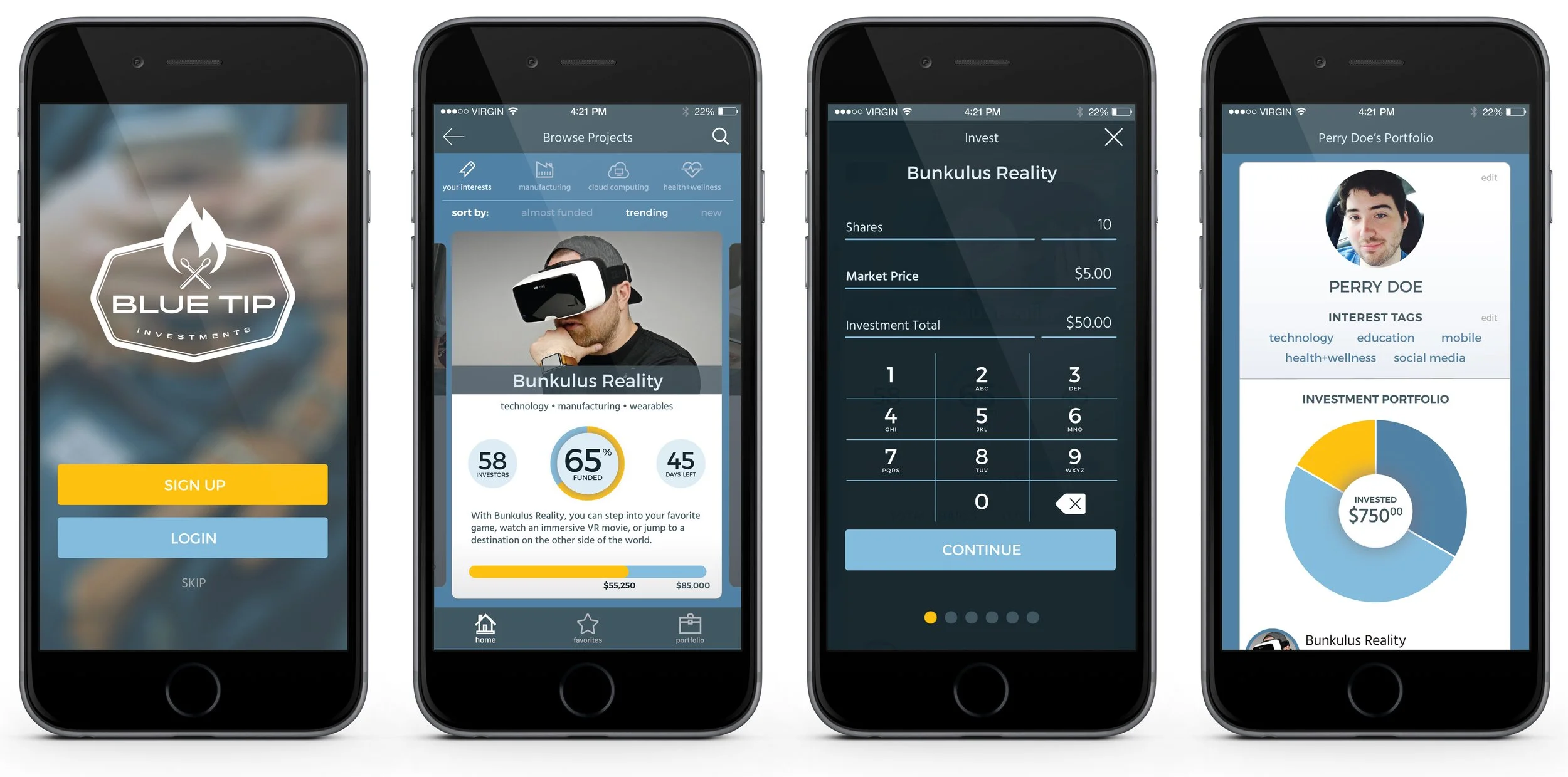
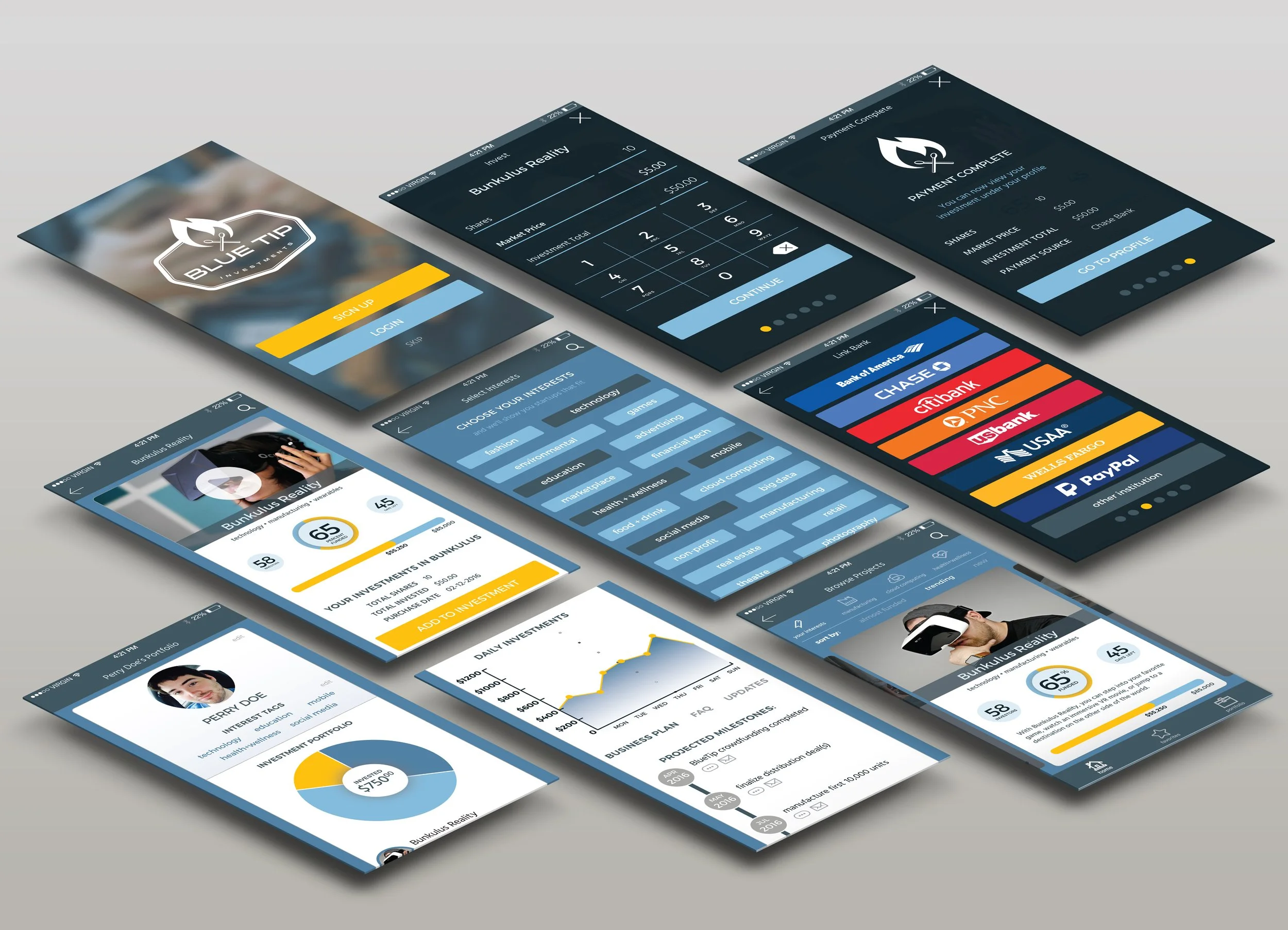
The final high fidelity designs leverage the blue-dominated color palette and a tile design pattern, already very familiar to our target user, making the app easy to navigate and a pleasure to use.
I gave particular attention to the design details of the investor flow, maintaining simplicity and transparency in an otherwise complex mobile transaction.